Hello again. I never get tired of saying this) We love in our studio free communication with our users, well, that is. when you are not puzzled by the framework in which you were put in order to write the desired article. On this site we only talk about topics that are of interest to us and tell you about them. And so, in the previous article from a series of training material about Vkontakte, we created a VK group and talked a little about its promotion. But still, to be honest, this is not all, the functionality of the group in social services provided to us. network allows you to design a group or a public very interesting and even professional. So in this article we will tell you how to beautifully design a VK group and make a beautiful menu for it.
WIKI markup is used to design groups. In this article, we will not go deep into it, because if you mix everything in one article, then we will completely confuse you friends, but our task is different. We'll talk more about wiki markup in the next article, okay? Let's continue then.
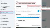
In this article, we also cannot do without the Wiki, but we use it here to a minimum, so do not delve too much)). First, we need to create an interactive menu for your group, for this we need to make preparatory steps. First, let's change some of the settings in the group. We go to the "Community Management", then to the "Discussions", and here we need to connect the "Materials" and make the discussions open, as shown in the picture

Ready! Next, let's start preparing the images. At this stage, it is advisable to be able to work with graphic editors, otherwise you will need to contact freelancers, and this is a waste of your money. Of course, it’s better to learn this, it’s not difficult at all, and all the more it will come in handy for you more than once. We'll show you how to do this in photoshop, although you can do the same thing in any other editor.
We make a template for the VK group as in the picture below.

The menu will be located in window A, its dimensions may differ from those shown in the image. It all depends on the size of the buttons on your menu. In our version, we suggested making one button per line. If you need to make 2 buttons per line, then the width of window A must be reduced to 377px maximum. Usually, we select the height empirically. In this version, the height of 377px is chosen when placing each element on the main page of the group in one line.

The markup stage is behind us, now we make a suitable image, cut our drawing into zones and write the inscriptions we need, and do not forget that each separate zone of the picture with the inscription that you write will be your menu button. How to do all this, I think it is not worth writing, tk. it will turn into a separate tutorial on Photoshop, we may write about it, although I don’t promise - the site has a wrong profile. But if there are many requests, then I think we will add an article))

When you save the project in Photoshop, deleting all unnecessary elements (Photoshop cuts and saves all the pictures and white fields along with them), you need to change the name of the pictures, preferably, for convenience, by numbering them in order, according to how they will be placed in the menu ...

Fuuuhhhh, we also finished with this stage)) There is not much left! Then we turn to the group itself. After we changed some settings (at the beginning of this article), we will see new tabs on the wall: "Discussions" and "Latest News". Click on the "New Topic" label in the discussion tab and make a menu page.

It must be named the same as on the graphical menu, and then fill in the field with a description. When you have filled in all the information you need, confidently click "Create Topic".

You will see the created message on the wall. Further, in the same way, you create the required number of pages (depending on how many menu sections you have).

Everything is ready? if yes, then we start editing our menu. We use the "Fresh news" tab for this. Again, feel free to click "Edit".

We again see with you the editor window, which we are no longer afraid of)), we have already met with him. Having switched to the visual editing mode (for this, use the camera icon in the VK editor), load all our pictures (menu fragments) in the sequence in which they will be in the whole image. Change the name to one that is understandable to visitors. Then we go into wiki-markup mode and edit the code (we will tell you in detail about wiki-markup in the next article, I'll tell you an interesting thing.

Sample code for the intended menu:
One point is very important here - for fragments that do not serve as a button, you need to write the tag "nolink" instead of a link to the page. Otherwise, the fragment will become clickable, and when your user clicks on it, the fragment itself will open as an independent image, but do you need it?

If something is wrong, then most likely you made a mistake in the code, check everything carefully, and more than once. And if you did everything correctly, then after clicking on the name of the tab of the main menu of the group, you will see a ready-made graphical menu that looks like one whole together with the avatar of the VK group.

If your menu on the lower level does not coincide with the avatar of the Vkontakte group, then achieve alignment in the code in the lower fragment by changing the height in px. With large changes, this can affect the quality of the picture. In this case, in the original template of the graphic editor (in our case it is Photoshop), make changes in the size of the desired fragment and, if necessary, redraw the entire layout. that's all friends, the design of the VK group is over! You are now a professional group owner.
In another article from the training series about Vkontakte, we told you how to make an interactive menu and design a VKontakte group professionally. In our next material, we will take a closer look at the wiki markup and try to style the group by delving into this markup.
As always, we are very glad to receive any comments from you, write friends more often))
VKontakte group hat
It includes community name, URL, status, description. These blocks play an important role, since they affect the ranking (internal search of the social network + search engines). They are also the hallmark of any community. This is exactly what the user pays attention to when they first visit the group. In the header, you must indicate key information about the activities of the company. The visitor of the page should immediately understand what you are doing and what services / goods you offer.
VK group name
The system limit is 48 characters. The title is the keyword with which you promote your community on the web. Along with the key phrase, you can write the name of the brand / store / workshop.

When writing the name, it is forbidden to use Caps Lock. This will not play into your hands when promoting the community, but will only anger your subscribers and customers. It is also necessary to follow the basic rules of the Russian language. Don't try to be more cunning than the system.

Community status
This is a special field that is placed under the group name. You can write something tempting, interesting or important in it. For instance:
- Notify the audience about new promotions and discounts;
- Leave contact details for feedback with the manager.
The system limit is 140 characters (with spaces). Yes, this is a small space, but it can be filled intelligently. You can also place a keyword in the status (if necessary). As stated, this will positively impact your rankings.

In the statuses of many communities, you can find wise and beautiful quotes from writers, philosophers and successful people. This is one of the most common mistakes when promoting a VKontakte group. Tip: leave quotes for personal accounts.
VK group URL
After creating a new group, it will automatically be assigned an address. It is a series of numbers. It's not very pretty, and no one wants to memorize them. That is why it is important to take care of the aesthetics and good name recognition. Replace numbers with alphabetic characters. Come up with a small name or word to describe your brand.
To do this, open the "Community Management" section. Next, go to "Settings". There you will find the original URL. Erase all unnecessary and add a new version of the name (it should be written in Latin).
Agree, it will be easier for the audience to remember a letter combination of symbols than a chaotic set of numbers.
Group description
You have specified the name of the group. Now it's time to tell what / to whom it is dedicated. What do you do? Who do you work with? How many years on the market? Many community owners or administrators ignore these logical questions, the answers to which can be perfect descriptions. Instead, they create something like this:
Example # 1

Example No. 2

Example No. 3

Each of these examples is missing key information. Somewhere they forgot to indicate the name of the company. Somewhere they did not consider it necessary to talk about the services offered. And somewhere they "got off" with a set of words similar to key queries on the web. As regrettable as it may sound, such groups are created daily in whole batches.
And even if keywords do work in the ranking, this is a risky tactic. You should always keep in mind the comfort of your followers and customers. Do you think they will like this kind of text in the description?
Will they give trust to a company that can't even tell about itself clearly?
Now is the time to talk about how to create a competent and beautiful description of the community. Follow these guidelines when filling out the information:
- A neutral greeting or a fluent introduction. It should be directly related to the activities of the company. Don't be afraid to start with keywords;
- A short listing of the main services. To make it easier for users to read, arrange it in the form of a list;
- Features of your company. Briefly summarize the key brand benefits. What sets you apart from the competition? (in fact, and not in the wildest fantasies). If you're doing self-praise, always add supporting arguments;
- Indicate contact information (preferably several options).
Try to keep your description concise. You will still have time to tell about yourself in detail. And it would be good if the audience had the patience to fully master the familiarization with the group's cap. Experienced users of the social network VKontakte indicated their recommended length for describing a group - 500-1000 characters without spaces.
You have already had the opportunity to familiarize yourself with the unsuccessful variants of the description. Now study a good example:

VK group design
Are you puzzled over which one is better to choose - an avatar or a cover? Now you will understand why the cover is the most successful option. There are reasons for this:
- The cover sits nicely around the entire perimeter of the cap. This adds aesthetics and appeal to the community. Of course, if the cover is made with high quality.
- You can indicate a lot of different information on it, and this text will not ripple in the eyes, as is usually the case with an avatar (when a whole dissertation is written on a small image).
- The avatar will remain in the group and will appear on the miniature. By clicking on the avatar, the user will be able to look at it up close.
Contact details

Company Information (Benefits)

Name and logo

You can specify all blocks if it looks organic. Or choose the most important information that suits your specific goals.
Make sure that the background of the cover evokes pleasant emotions in the audience. Of course, you won't be able to please everyone. But the point here is rather that you should not upload some gloomy and unsympathetic images. You don't want to scare off your potential buyers.
It is also important to consider the field of activity when choosing a background. If you are promoting legal services, then a picture of violets and butterflies can hardly be considered a suitable option.
Just take a look at a good example of a cover for the VKontakte community (culinary theme). Beauty, isn't it?

Stylish, appropriate, pleasing to the eye.
Of course, the design of the group cannot be limited to the choice of cover and avatar. If necessary, you will have to create a beautiful menu, an illustrated catalog of products, select themed covers for albums with photographs. It's great if you can adhere to a uniform style when designing a group. Site owners often style the VKontakte community according to the same principle.
But it is enough to get by with the standard combination: Cover + Avatar + Menu. Here's what you can get out of it:

VKontakte group content
With sections of the community, everything is more or less clear. Now we turn to the key block, which will have to be dealt with on an ongoing basis. This is a variety of content.
Actually, all the previous actions were taken to post this information. It's time to go on a long voyage! The ideal content in the VK community is 80% of useful / cognitive / important information, and 20% of advertising.
You started creating content. Consider the following nuances:
Language availability
It is not a sin if you can write in a beautiful literary language. But try not to complicate it with abstruse phrases and narrow-profile terminology. Write lightly, sincerely, unobtrusively.
The audience does not always want to strain their brains, because social networks are created more for recreation and entertainment.
Catching details
The news feed of active users is full of content for every taste. You have to stand out from the crowd, be well recognized. When scrolling through the feed, the user pays attention to the post elements such as the title and image.
Publish author's, unique and original content. Look for or create something rare, special. If you are using pictures from the Internet, make sure they are up to date. Want to add a meme? Do it! But he must be at the peak of his popularity. Seals? No problem! Find a good photo.

Content formats
There is only one rule to distinguish here: VARIETY. Alternate between photos, videos, audio files, infographics, and more. Interact with the audience, answer questions, run contests and live streams.
Text formatting
Recently, the fashion for longreads has returned on social networks. But they need to be drawn up correctly, otherwise it will be difficult for users to perceive such a flow of information. Be sure to break the text into paragraphs. Use lists, subheadings, emoticons.

Correct links
It often happens that a VKontakte community is created to attract traffic to the site. Therefore, the content of the group contains links to go to various pages. For a link to be correct, it must have a URL tag. It is also recommended to use link shorteners. Tags are created for you (to track traffic), and abbreviated addresses are designed for the comfort of your community members.
Optimal time to post content
There is no time of day when content is firing across all social media groups. Everything is individual. It all depends on your target audience. Try to understand one simple truth: schoolchildren, students, young mothers, retirees and business people visit social networks at different times. And you have to identify it yourself.
Conclusion
- Create a competent and attractive hat;
- Take care of the original and stylish design of the group;
- Optimize all key sections in the community;
- Post the right content.
Like 0
The topic of this article is the new design of VKontakte. Changed again, now you can set the horizontal cover in the group. Making your VK community with such a hat is much more interesting. Quite frankly, no knowledge of Photoshop is required here. And you can make a beautiful picture without any special skills even in PowerPoint, Fotor, Canva, Pixlr Editor.
Going to the group, you will notice that in those groups the buttons "Pinned Record", "Information" and "Press Menu" have become visible. And before they were hidden. Naturally, all the design of the groups went right away.
Loading a new cover
Now let's figure out how to enable the ability to set a horizontal header. Let's click on the "Control" button.


Then we click on the last one and load the new cover of the VKontakte group. This is where you can understand that the download file can be of any size! But no less than 1590 × 400 px. We create a cover prototype in any editor. Next, we can select and save the area that meets the requirements of the VK. Here's a hint where to find a cover image, which editor to use to
Why is the new VKontakte design interesting?
The main thing: there is more space for information. Now here you can write the name of the group, the purpose of its creation, a call to action, and so on. This design will be logically complete and more functional. But you can leave the old design, this is a matter of taste for everyone.
When you design the horizontal cover, you will notice that the inner menu now somehow falls out of the general context. I think it would be better to pin the picture to go to the menu. And use it to host wiki pages in a group.
At the same time, I would like the developers to add some more opportunity for setting up a beautiful transition to the Wiki page.
I would like to note that since 2016, the developers of the Vkontakte social network have been actively trying to set up this network to promote business. Make it more business-friendly or something. From my point of view, this is very good and is in great demand among many Internet entrepreneurs.
But the most important thing, in my opinion, is that they need to carefully think over the "Bans" system so that entrepreneurs can work calmly without interfering with those users who have come to have fun on the social network.
How to make a cover for a Vkontakte group online
Turn on your creativity and choose what you like the horizontal cover or the already familiar Vkontakte design. The creation of online and the installation of a new cover visually, step by step, is presented in the video below the article.
P.S. I hope this information is useful to you.
P.S.S. Include your creativity and good luck in all your endeavors!
I was recently puzzled by the design of my VKontakte group. I saw a lot of beautifully designed bands and wanted to do something similar. After a few hours of studying Wiki markup, I finally made a beautiful banner for myself and drop-down graphical menu leading directly to the pages of my site. In a nutshell, how it's done. First, two pictures are created in Photoshop at the same time, then one of them is cut into several parts. Further, on the edit pages in VKontakte, a special code with external links is inserted. Well, now let's talk about everything in order.
I design Vkontakte groups
High-quality design of VK groups and publics, pinned menu, drop-down menu, internal graphical menu, catalogs, internal navigation - prices and portfolio.
Attention!
In connection with the next update of VKontakte dated 10/31/2016, this option for group design has become irrelevant. In part, a similar menu can be implemented on the Fresh news tab in the block under the status bar. But this will be a separate menu, not a single composition with an avatar.
Step 1.
Create a new document in Photoshop, about 850x700 pixels in size, fill it with white. In this example, I immediately overlaid the VKontakte interface on top for clarity. Now we need to cut out two windows in the layer through which the actual graphic design itself will be visible. First select a 200x500 pixel rectangle and press Del. Then select a 510x309 rectangle and also press Del. 
Align the rectangles to the bottom, the distance between the shapes is 50 pixels. This design is designed for one line of the group name, one line of status and three lines of description and technical information. If you have a different number of lines, then adjust the height of the left picture in place.
Step 2.
Now we place all our graphic design under this layer. In this case, I put a picture with the main background, then I wrote the text, and then in the left rectangle. 
Step 3.
Now we immediately save the right rectangle (avatar) as a separate 200x500 pixel picture. This is a ready-made picture for decorating the group. It is loaded into the block in the upper right corner of the group, where it says "Update Photo". And the left picture must be cut into several pictures according to the number of menu items. In this case, these are 5 pictures 510 pixels wide. 
Step 4.
At this step, we need to upload our cut pictures to VKontakte. To do this, immediately under the group's description, select the "Fresh News" block, in my opinion that is how it is called in the original. I renamed it “Menu”. Click "Edit". Important! First, you must have an Open Group, not a Page. Since there is simply no such item on the Page. And second, in the Community Management> Information> Content menu, the "Public" item should be selected. 
Step 5.
So, in the "Editing" tab, we click on the camera icon and load our five sliced menu pictures. VKontakte will load them in its own way, reducing the size to 400 pixels in width and assigning the noborder tag to the image. In the next step, we have to tweak the code a little. 
Step 6.
Namely, we set the original image sizes and change the noborder tag to the nopadding tag. We also need to put down the url of links from each menu item. In this case, the first link leads to the internal page of VKontakte, and the other four links lead directly to the pages of my site. 
Below is the original working code of my menu. You can use it as a base. In it, you change the pictures to your own, substitute your sizes and write your links. And make sure that there are no spaces between square brackets in the code, and there is no new line, otherwise there will be spaces between the pictures in the graphic picture.
[][][]
Step 7.
I repeat once again, to open this menu you need to click on the inscription "Menu". And so it is always folded. Read the comments to the post, there are many questions sorted out. Well, join my group in VKontakte.
In this article, we will take a step-by-step look at how to properly create, configure and properly design a VKontakte community
Community building
You can create a VKontakte community by going to the "groups", "management", "create a community" tab.
Community type and topic
To begin with, you will need to decide on the type of community, depending on your goals and choose the topic of the community.
Group decoration
After choosing the type of community, you can proceed to the most important one, this is the design. The design of your community is a kind of business card of the company, depending on how high-quality the design is, your potential subscribers will draw conclusions about your work.
You can download the cover by going to "settings", then click "download".

You can place on the cover:
- title
- the logo
- motto
- contact information
- promotions or call to action
An important point: The cover is the first thing a client sees when they go to your group, so the cover should be bright and attract attention.

Cover in the MTS community

Cover in the Tinkoff Bank community

Cover in the "HeadShot" community
Sizes of images for the design of the VKontakte community.
Cover size for VKontakte group 1590x400px
Avatar thumbnail size - 200px circle


Also VKontakte not so long ago appeared dynamic covers for communities.
Dynamic covers have very rich functionality, with the help of which you can display the last subscriber, the best commentator on the cover, set the background change as you wish, add a weather, time widget and much more.
Community Description
In the description, the main thing is to describe as briefly as possible the main advantages of the company.
An important point: there is no need to describe everything that your company has been doing, is doing or will be doing. No one will read the long description. You have a few seconds to grab attention before the client starts looking at posts on the community wall. Therefore, the description should only contain key points that reflect the essence of the community / company.
Life hack: In order to make the description of the community in more detail (with photos, links and a beautiful layout), you need to put a wiki post in the fixed entry, in which there will be a bright picture and a call to action.
Examples of wiki posts:


Group avatar
The community avatar is an important detail in the overall construction of a quality design, in this article we have highlighted several very important points that you need to consider when creating a community avatar.
Taking into account the fact that community covers are now predominantly used, the avatar itself in the group is displayed as a miniature. Therefore, here we will talk about how important it is to design a miniature of an avatar. As mentioned above, the avatar thumbnail size is a circle with a diameter of 200px.
- Text
If you are placing text on an avatar thumbnail, it is important that it is large and does not extend beyond the avatar. - Understanding
It is necessary to place an image on the avatar, on which it will be clear what is shown. - Minimalism
To make your avatar look relevant, you can make it in a minimalist style: fewer words and unnecessary elements that do not carry almost any semantic load. The avatar thumbnail should be as simple and readable as possible. - Attract attention
So that the thumbnail of the avatar attracts attention. It is necessary to arrange it so that it is not too white and boring, otherwise it will get lost against the background of more colorful competitors' avatars.
- Text
What to place on the avatar thumbnail?
Consider the options for using an avatar thumbnail to attract followers to the community.

Community settings
By going to the "community management" tab, you can come up with a short URL for the page and provide additional information. 
Further, in the "Links" tab, indicate links to your page in other social networks and a link to your site. 
In the "Sections" tab, enable the required. It is more convenient to set up a limited community wall so as not to rake it out from spambots' publications in the future.
Include products if your community is to sell products or services. 
You can also add applications to the community and customize them for your own purposes. For example, the Applications application is the most convenient for working with leads. This is an online appointment and taking orders. Or, for example, the "Maps" application, with the addresses of your stores, offices, events. With the Buy Ticket application, you can sell tickets to events right on the community page, ie. subscribers / customers will be able to buy a ticket without going to your site. 
Wiki menu - beautiful and informative
This is another way to show the uniqueness of your community, to grab the attention of customers, and also to structure services, products and all information about the page. Plus, using the wiki menu, you can set up direct links to go directly to the company's website.
Examples of wiki menus: 


You can see a detailed guide on how to create a wiki menu here -